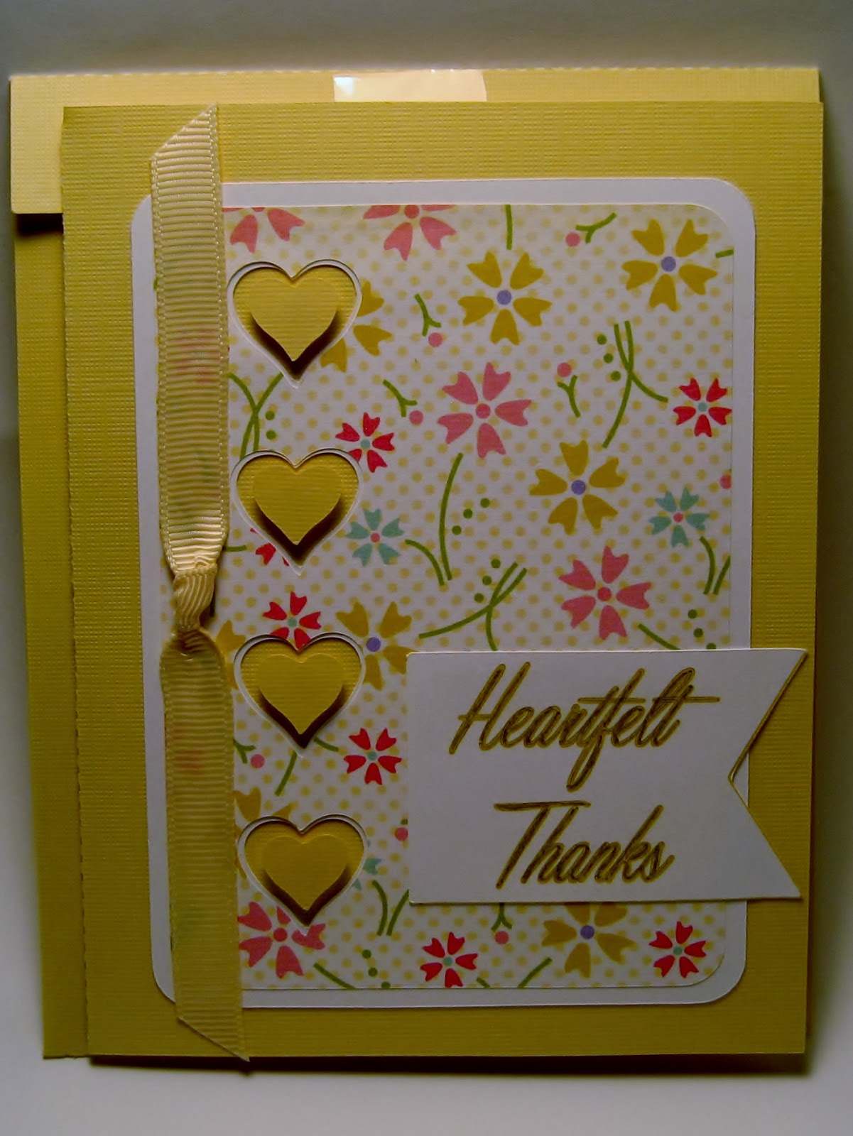
I keep looking for ways to use the embossed foils - here's another example. The original card was portrait and I felt that if I turned it landscape, it would leave more room to the left of the sentiment and balance the card better. Below is the original card:
The first time I created this card I didn't like it. So I changed it! A lot!
Below is the original card. The colors just didn't pop, the scallop was too large, the font was too wishy-washy, the flowers too simple, the leaves too pale. I really like the orange and green color scheme of the new card. I'd love to see a section in the Pazzles Craftroom where we can get advise from the pros on how to make a better design, but have it be a forum as well. I haven't taken advantage yet of the Designer Chat - hard to do when I craft on the weekends.

And this is one of my favorite designs.
The first card I made actually got sold before I took a picture of it. Here's the second one:
I must have something against yellow - you'll seldom find a card of mine that is mostly yellow! I might still need to redesign this card so there is room for the ribbon on the left. I didn't include a ribbon on the new card except on the left side of the tag - I like the rounded corners to show.
Please leave me a message if you have any suggestions for creative designs or just a critique of these cards. Thanks!


No comments:
Post a Comment